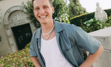
Meet Nayo Kim | Graphic & Type Designer
We had the good fortune of connecting with Nayo Kim and we’ve shared our conversation below.
Hi Nayo, we’d love for you to start things off by telling us something about your industry that we and others not in the industry might be unaware of?
This is something I slowly came to realize: there are many different ways to be a good designer. It sounds quite obvious, but it took me a few years to come to terms with it. Upon graduating college, I jumped straight into the commercial world of branding. There, I used to associate a good designer with commercial success; that working at a big agency for top clients means the same thing as being a successful designer; and that being an executive creative director at a big agency should be the end goal of my career. However, the more time I spent in the industry, the more I realized being a good designer does not always involve a fancy title, a big agency, or a top client. We see a lot of appeal for the design awards, social media followers, and client lists, but these are not as big of a deal as it may seem to those outside the industry. It was a long, but necessary journey to define what a good designer was in my own eyes, without influence of what others think.
Alright, so let’s move onto what keeps you busy professionally?
To put it simply, I am a graphic and type designer based in New York. My work spans various areas of graphic design, including brand identity, print, editorial, website, and typeface, with a focus on arts and culture. I am passionate about finding the simplest truth in everything I design. I believe that in every project, there’s always at least one magical seed, hidden beneath the surface. It’s a goal of mine to find that seed and give it the right care, so it grows and blooms a flower at the end. Once I uncover the essence of the idea (the magical seed) that drives the creative concept, I bring forward my typographic lens in order to execute it. What I love about type is that it can be so simple, sophisticated, and expressive–all at the same time. So much potential is hidden in the form of letters, that there’s always something new you can create with it. I want to explore new ways of utilizing typography in different projects, pushing the boundaries of letterforms in their traditional function and purpose.
Truthfully speaking, there are still a lot of challenges I haven’t overcome yet. However, there is one solid lesson I’ve learned along the way: no matter what, focus on having fun. I’ve come to realize from my own experience that having fun is the most honest, healthy, and important measure to keep in mind in order to move forward in the right direction without hurting anyone, including myself in the process.
Let’s say your best friend was visiting the area and you wanted to show them the best time ever. Where would you take them? Give us a little itinerary – say it was a week long trip, where would you eat, drink, visit, hang out, etc.
This is an exciting question! After living in New York City for about seven years, I’ve made a collection of my favorite things to do in the city. Despite its many drawbacks, I love NYC for being full of so many wonders.
There’s many famous museums (e.g. The Met, MOMA, and Whitney) in the city, so it’s easy to miss the small ones, but I would bring my friends to those first! My personal favorite is the Noguchi museum in Astoria, Queens. Established, designed, and installed by Noguchi himself, this space features several indoor galleries with pieces from his archive. There is an outdoor garden featuring his sculptures, showing how perfectly they complement nature.
New York City has so many incredible stores that specialize in design. Printed Matter, Inc. is a famous bookstore/gallery in the Chelsea neighborhood showcasing many independent publications and artist books. They host a massive art book fair every spring, congregating art and book lovers from all around the world. It’s so inspirational to attend the fair, meeting passionate, talented, and like-minded people promoting their latest work. Another store, Philip Williams Posters, carries thousands of original vintage posters from, well, everywhere. They also have vintage ephemeras such as magazines, postcards, and flyers. Its one of my favorite places to look for typography inspiration, too!
This recommendation is a bit funny to include, because I haven’t been to it yet. However! This is on the top of my to-do list, and I’m waiting for the perfect summer day to take a short train trip to Untermyer Garden. Located slightly north of Manhattan, this huge public park is full of abundant flower gardens and monumental architecture. It seems so gorgeous, especially in summer time, and way less crowded than Central Park. It could be a short getaway from the city, somewhere relaxing and free from the traffic and tourists.
Last but not least, I would end the day at one of NYC’s many breweries. There’s so many, and they all specialize in different types of beer. If hoppy, bitter India pale ales (IPAs) interest you, check out Other Half Brewery. If you’re into fruity, tart, or sour beer, then look into Evil Twin Brewing. These are my favorites, and both also have food trucks/vendors close by. I like going to breweries because they’re laid back, making it a perfect place to end a long day of walking around to hang out for a few hours, chatting with friends and recharging our batteries.
Who else deserves some credit and recognition?
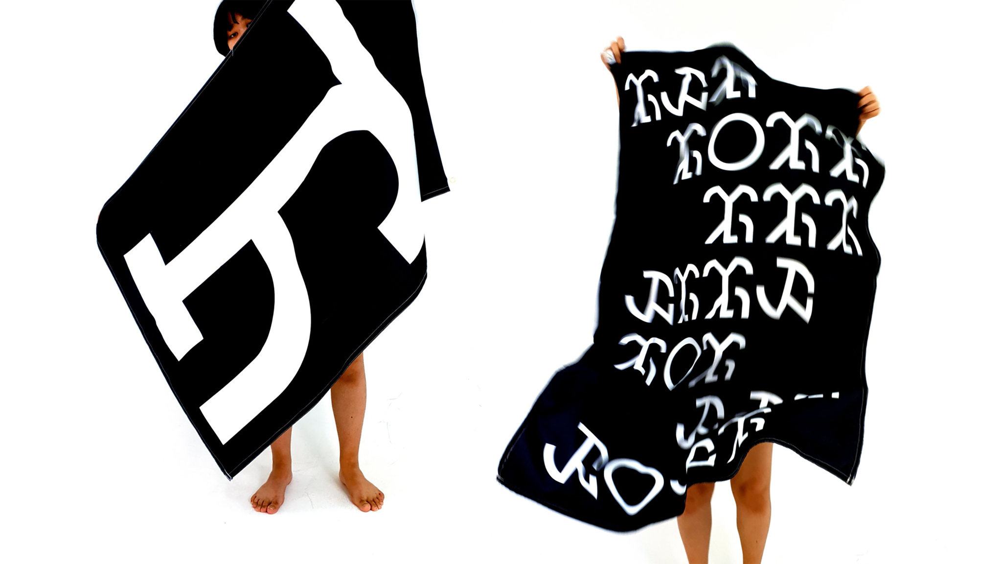
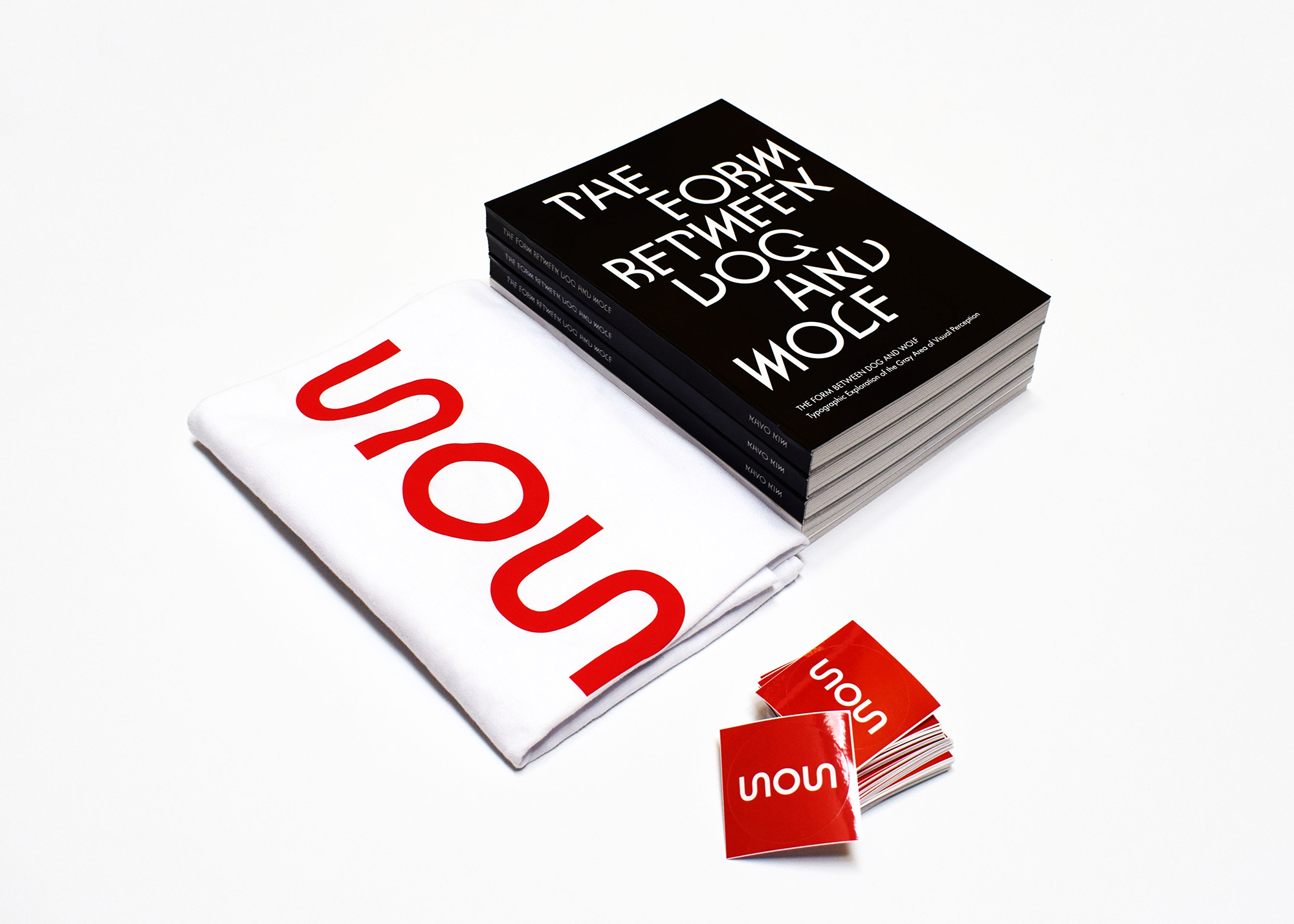
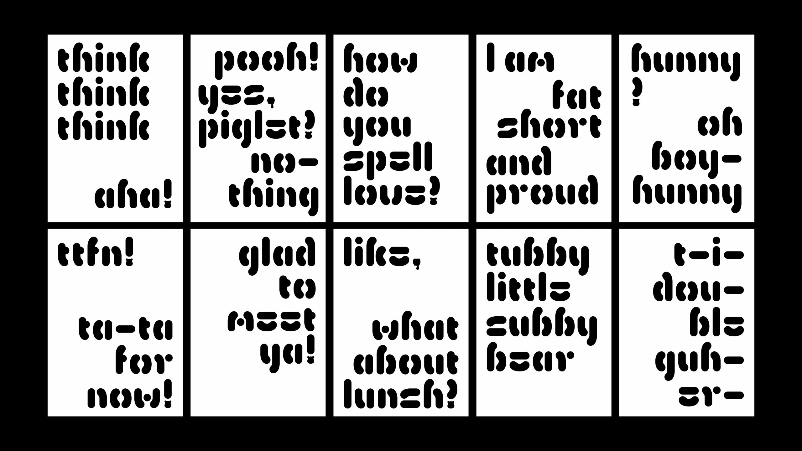
I feel bad because I don’t remember their name, but I’d love to shoutout one of the judges at my graduation show at École cantonale d’art de Lausanne (ECAL). My diploma project was about typographic exploration of the gray area of visual perception. It questions the relationship between what (we think) we see and what (we think) we know about how the brain interprets letterforms when reading. My typeface draws inspiration from Cubism, and has an illegible, experimental, and downright strange appearance. The appearance was especially stark compared to the typefaces of my peers, who showcased polished, industry-ready typefaces with historical reference. The judges’ reaction to my typeface was polarized. Some were confused and some were intrigued. When the show was over, one of the judges came to me and said something I’ll never forget. “There may be only one out of ten people who would appreciate the work you presented earlier. But I think you should keep going. What you do is worth it.” These words came to me at an emotional point. The exploration and journey may not get the polished result, but it still has its own weight. These words help shape my ethos and allow me to continue designing on my own pathway.
Website: https://nayokim.com
Instagram: @nayo.k
Linkedin: https://www.linkedin.com/in/nayo-kim-88604889/
Other: nayokim.design@gmail.com
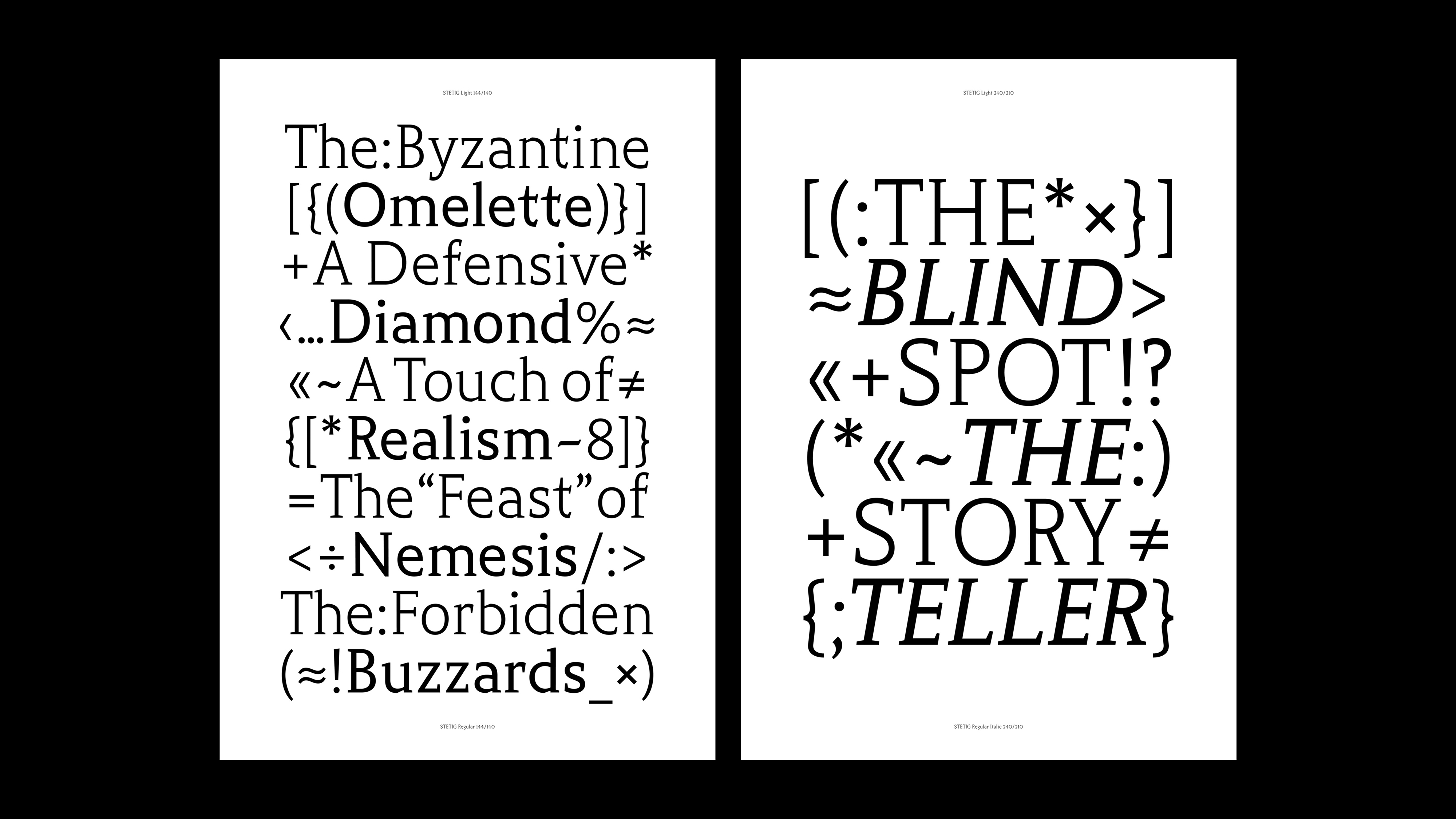
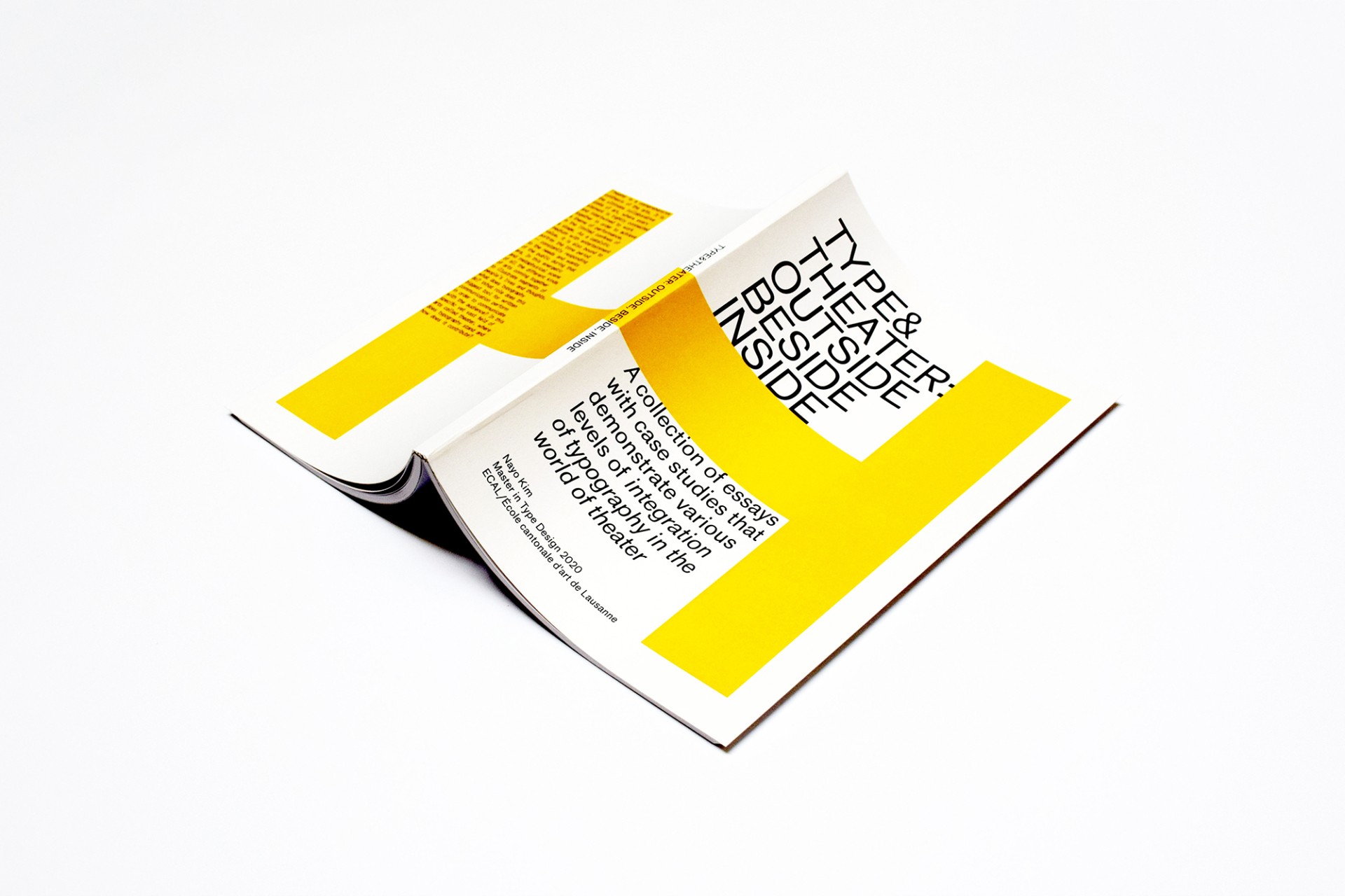
Image Credits
Nayo Kim