Meet Xuan Cheng | Information Designer, Data Analyst
We had the good fortune of connecting with Xuan Cheng and we’ve shared our conversation below.
Hi Xuan, let’s talk legacy – what do you want yours to be?
This is the question I think about a lot: If tomorrow were my last day, which projects would I be most proud of? The answer, although it may change throughout different stages of life, consistently involves multidisciplinary endeavors that intertwine technology with higher design concepts or cultures. It could be a printed novel centered around a fictional band, which contains a QR code of a curated playlist on its content page. Or it might be an interactive booklet crafted from handmade paper, narrating the story of the art of paper making in ancient China.
I love the fusion of low-tech and high-tech elements. By blending analog and digital, traditional and cutting-edge, I consistently discover innovative possibilities that transcend the surfaces of cultures. So I call myself a visual designer, an illustrator, a researcher, a data analyst, a coder, and a clump of redwood trees of insane culture-technology nerdery.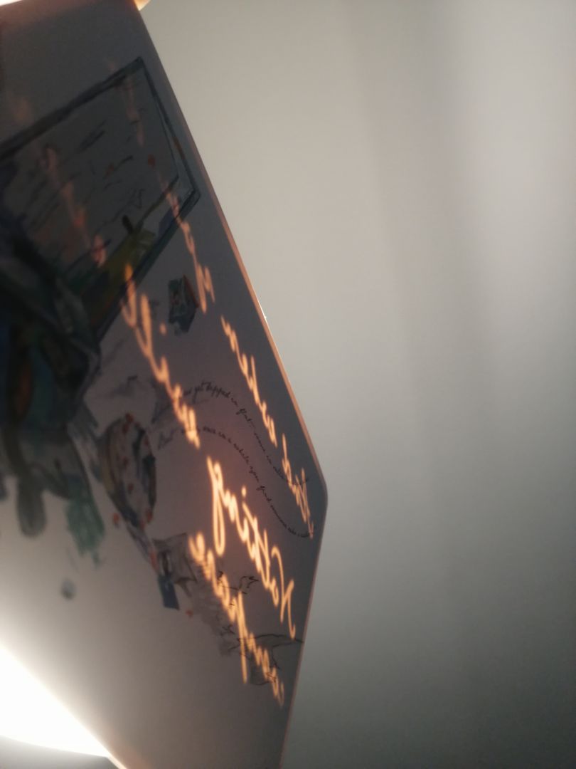
Let’s talk shop? Tell us more about your career, what can you share with our community?
My dual roles as a data analyst in my day job and an editorial designer in my freelance work may appear distinct at first glance—traditional publishing versus AI-related projects. However, I see them both as designs of information and storytelling. The fundamental challenge lies in how to craft a data structure that captivates audiences and enhances their reading experience, which I approach from two perspectives.
As a designer, my focus is on deriving meaning from content and translating abstract concepts into visual narratives. I strive to convey the essence of a message through visual storytelling techniques, allowing readers to engage with information in a compelling and meaningful way.
From a technologist’s standpoint, I use technology as more than just a problem-solving tool. I view it as an eye-catching opportunity, as people are inherently drawn to the allure of technology. By leveraging technological advancements, I aim to enhance the design of all sensations and increase the interactivity of the designs I create. And many times, the medium is the message.
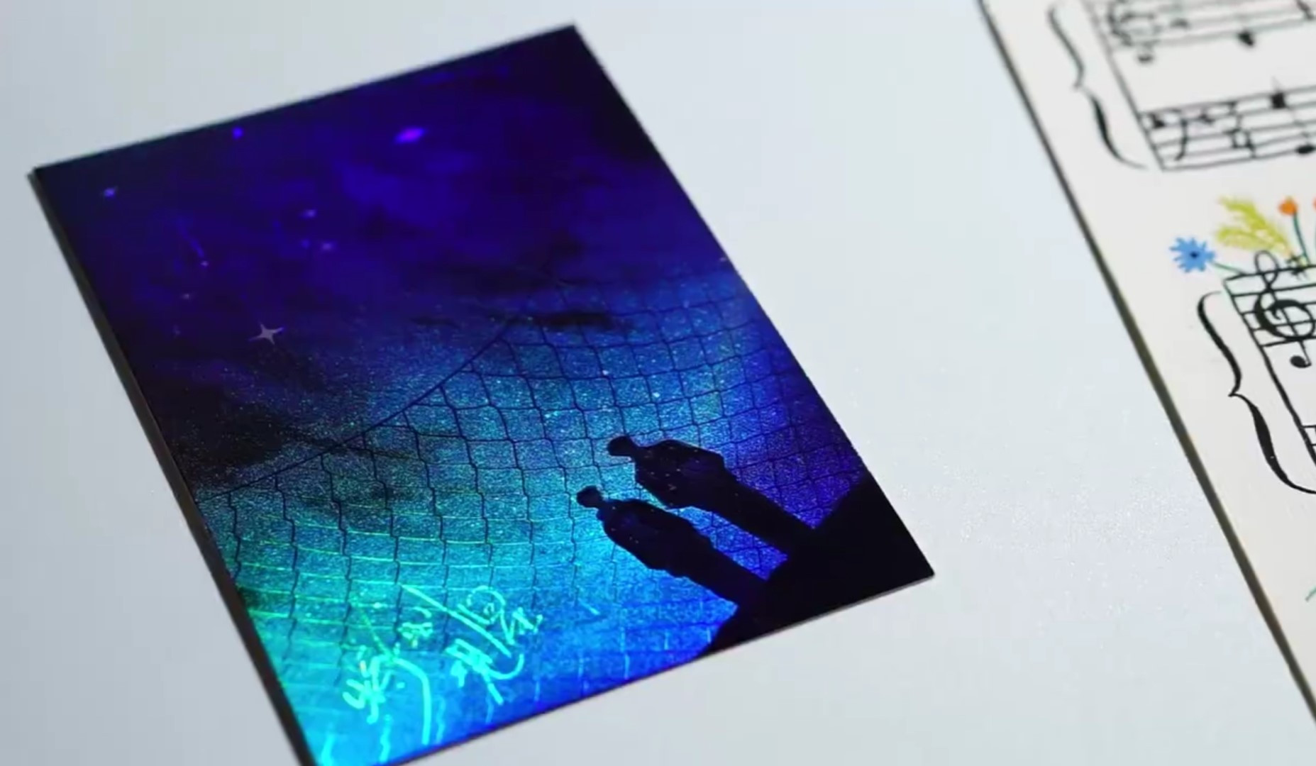
An example of this is the book I worked on called “The Pearl.” The main challenge of the book is how to convey a sense of healing after traumatic events. The protagonist in the book is broken after experiencing domestic violence during his last marriage. His violent experience left not only physical scars on his neck but also emotional scars on his heart, which almost prevented him from pursuing a new relationship. However, the book chronicles his journey of finding the courage to love again with the support of his boyfriend. I was particularly struck by the theme of healing through the power of love and chose to represent this visually through the motif of fragmentation and integration. The book also features the characters’ unique love language, which involves watching movies together at home. So in addition to the book itself, I designed a postcard that features a quote from the movie “Flipped,” which is also the characters’ love language:
“Some of us get dipped in flat,
some in satin, some in gloss.
But every once in a while you find someone who’s iridescent,
and when you do,
nothing will ever compare. ”
Only the first sentence is printed on the postcard, and the rest of the sentence can only be seen when held up to the light. The illustration I made is based on the scene when the protagonist becomes afraid that his love will hurt his lover and decides to leave. The broken suitcase, smashed cake where the first sentence float like smoke, and ripped calendar all contribute to the fight scene, which is resolved by that person who’s iridescent like the glimmer of the words: “And when you do, nothing will ever compare.” The use of light also comes from the inspiration of the projector that the main characters use to watch movies together.
Another project of mine called <The Long Breakup> delved into the intricate concept of the butterfly effect. In this novel, the antagonist discovered the secret of this phenomenon and harnesses the power of randomness. To reflect this theme visually, I developed a program that analyzed the entire book, randomly selecting words as design elements.
This approach speaks to the essence of the butterfly effect portrayed in the story. Just as the protagonist’s actions had unforeseen consequences that rippled through the lives of those around him, the randomized selection of words in the design aimed to capture the sense of interconnectedness and unpredictability. Each randomly selected word was visualized and appeared in chapter pages of the book, serving as a nod to the intricate web of cause and effect depicted in the narrative. This artistic endeavor not only paid homage to the theme but inspired the reader’s exploration within the book.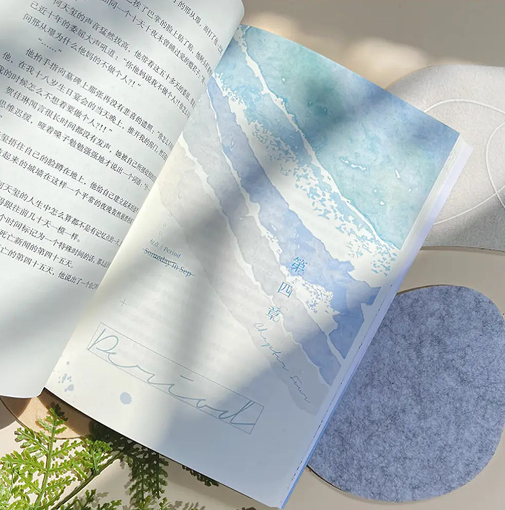
If you had a friend visiting you, what are some of the local spots you’d want to take them around to?
When visiting LA, trying seafood is a must. One of my favorite places is The Fire Crab, where I highly recommend trying their Cajun-style crabs, lobster, and crawfish. Their grilled oysters are also fantastic. You’ll surely enjoy the experience, especially if you’re not from New Orleans. However, I must warn you that if you’re on a diet, their Garlic French Fries might add a bit of guilt to your meal.
As for museums, the Academy Museum of Art and Getty Center are excellent choices for finding inspiration. If you’re interested in design, I suggest visiting the gift shop at the Hammer Museum, as they have a great selection of design journals.
For graphic designers, exploring the vinyl shops alongside Sunset Boulevard can be a great source of typography inspiration. I often visit those shops to seek out new ideas for my work.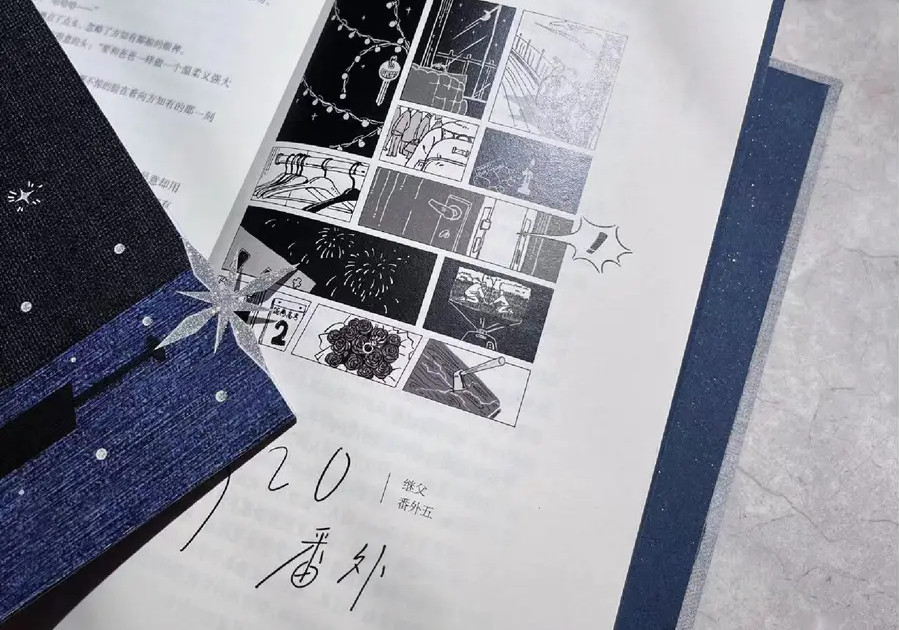
The Shoutout series is all about recognizing that our success and where we are in life is at least somewhat thanks to the efforts, support, mentorship, love and encouragement of others. So is there someone that you want to dedicate your shoutout to?
Apart from my day job as an information designer, I also freelance as an editorial designer, and have been in the Chinese Queer novel industry for 3 years.
During my journey as a freelance designer, I came to a realization that roughly 50%, of the design process is not design itself. Within a company setting, there are various roles such as art directors, project managers, and talent managers who oversee the progress and client relationships. I am incredibly grateful for my editor, who skillfully handles around 90% of these responsibilities. Her unwavering support has been invaluable, especially when it comes to my design experiments that may not always align with commercial art.
Creating a book is hard, and many of readers don’t understand the complexity involved. Very few experiences of crafting a book turn out well without the support of a skilled editor. Thanks to my editor, I have received the emotional support I needed and was able to persevere through challenges, ultimately preventing me from giving up on my profession prematurely. Her contribution has played a pivotal role in my growth and dedication to the field of design.
Because of the sensitivity of the industry, I can’t say her name, but I do want to shout out to her and show my appreciation.
Website: xuanch.me
Linkedin: https://www.linkedin.com/in/xuan-cheng-09336a174/